Our mobile SEO Guide has been updated for 2021/22
We all love and are addicted to our smartphones.
They connect us to the world.
Many people seem to run their lives on Facebook and Twitter.
Businesses have invested heavily in their mobile brand and presence.
The mobile marketplace is now a bigger market than the conventional way to buy online.
Mobile is exactly that, mobile, the internet in the palm of your hand, on the move.
But with the advancement of mobile technology, you don’t have to be mobile to use mobile.
More and more people reach for their mobile devices at home rather than logging onto their laptop.
Smartphones and Tablets have dramatically changed our lives and how we consume the internet and as a result, mobile devices are changing how we optimize for SEO.
You need to be mobile SEO-ready!
This mobile SEO guide 2021/22 will quickly bring you up to speed so that you can optimize your site to give the best mobile experience (UX) to your visitors
Mobile SEO Guide 2021/22
Mobile SEO is a big topic to talk about and this is going to be a long article so I have split the post up into sections to help.
You may benefit from bookmarking this page and coming back a few times
Table of contents
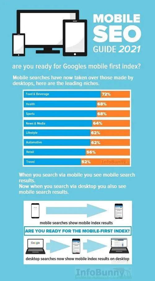
Let’s start with some stats to show you why mobile SEO is so important for your site to offer the best mobile experience.
In a short time, mobile devices have surged ahead of traditional desktop and laptop computers.
58% of all searches are now requested via a mobile device.
Sales of mobile devices are outstripping those of desktop and laptops.
Mobile will very soon account for the majority of searches and in many niches it already has.
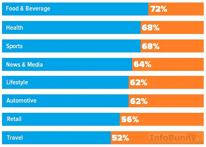
For more detailed Industry-specific trends in mobile search then check out the latest Mobile Search Report over at Hitwise
Mobile SEO is Search Engine Optimization for a website for users on smartphones and tablets.
Mobile SEO optimization also includes making your site resources accessible to search engine spiders.
All the normal “best SEO practices” that are covered in my SEO Guide 2021/22 all still apply and carry over when optimizing for mobile SEO.
It is more how you then deliver the mobile experience that is important.
Google has now switched to a mobile-first index.
For the first time, Google will determine rankings based on the quality of the mobile version of the site ahead of that of the desktop version.
Why? because more searches are now being made via mobile and Google sees mobile as more important and more relevant to cover the user’s intent when they search. When we talk about mobile we are not just talking about devices used when we are moving and mobile.
We are talking about devices that are very often in the same room as your laptop or desktop and we choose to use them over moving to the laptop and starting it up.
You can no longer offer up a desktop version of your site as a mobile version at least not if you hope to rank on the new mobile-first index.
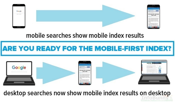
A new Googlebot will crawl your mobile site and determine if its performance, content, and user experience are up to scratch.
If so, you get a better ranking. If it is lacking, other sites will rank higher and you could lose out. Even if you’re not focusing on mobile you will still be judged by your mobile site.
Now your mobile SEO has to be as good as that of your desktop.
Responsive sites adapt to the screen size that the user views your site on. If they look via desktop or laptop they will see your site as you designed it. If they then view via a smartphone or a tablet then they see a perfectly scaled-down version of your site that perfectly fits the screen size of the viewer’s device.
This is by far the easiest option to use with your mobile site. It really does cover all your mobile SEO requirements with just one problem and it is quite a big problem.
To make your site responsive all you have to do is to use a good responsive theme. Most themes are now responsive. There are endless free responsive themes, but premium ones are better for updates and security reasons.
If you don’t want to change your theme then you can add a plugin that will turn your site into a responsive site.
Here are 4 plugins that will make your site responsive.
Responsive sites carry just one URL per page (read on to find out why this is important)
The problem with a Responsive Site
The problem in question is speed. Responsive mobile sites tend to be by nature slow to load on mobile devices.
And load time is an SEO ranking factor.
There are a number of optimizations that you can make to help speed up your site.
The first step really to boost your site load time is to limit the number of plugins that you use. Plugins despite being very useful do slow your site down.
You can add a cache plugin to help your load times. It’s ironic how you can to add a plugin to speed your site up when plugins slow your site down 😉
Limit the image size of any images that you add to posts. You can also then compress them to make the image files smaller. TinyJPG is a good site that will help you with file compression.
Alternatively, you can upload a plugin like WPSmush so that when you upload an image to WordPress it is automatically optimized.
WPBeginner has a great article that covers not only WP Smush but some other alternatives.
Also, make sure that you use jpg images as they are smaller files than png
This is not a method that I recommend. If you are technically minded or have the money to hire someone to help with the set up then it may be an option for you.
What is dynamic serving?
Well dynamic serving similar to responsive design,.
Dynamic serving websites like responsive utilize only one URL per page no matter how the content is viewed.
However, the HTML structure of your website will vary on a device-by-device basis.
I’m not really going to go any further into explaining dynamic serving because I don’t consider it to be the best option as it is very complicated to set up.
The main advantage of this type of mobile site design is that you have control over what is added to your mobile site whereas responsive is more of a clone of your main site. The sites can be identical or you can drop high resource files to help load times and also make your sites unique.
You do need to be careful both in the setup of dynamic serving and careful in using this method.
With the mobile-first index coming into play dropping files from your mobile site to help load times or to make it more unique could have implications for your mobile SEO. If the content is not on mobile then it won’t count on SEO.
Google also wants both your web version and mobile version of your site to look pretty much the same
Dynamic Serving is not only a complicated set up it is also complicated to explain so for more information please refer to Google guidelines for dynamic Serving
Separate domain offers your mobile site on a separate mobile site on a different URL – usually an m. domain – and with different content.
Google supports this method, but only if you make the correct connections between your regular desktop domain and the mobile domain.
Use rel=”alternate” and rel=”canonical” to tell Google how these pages are connected.
I’m glazing over just writing about this so for more on the separate domain method and how Google uses them, visit the Developers page.
Mobile SEO is all about making sure your site is crawlable and findable.
Your site needs to look good and load quickly and you need to know how your site is performing.
There are a number of free mobile SEO tools that you can use to see how you are already doing
The most useful tools can be found in Google Search Console.
You should already have a Google Search Console Account.
Within Search Console, you will find Mobile Usability
It is accessed via Search Traffic then Mobile Usability
This tool lets you know if your visitors have trouble using your mobile site.
Fetch and render is another search console tool that is really useful. It not only instructs Google to crawl your pages and index them it also shows you how Google sees your page.
You can test both your desktop and mobile versions of your site.
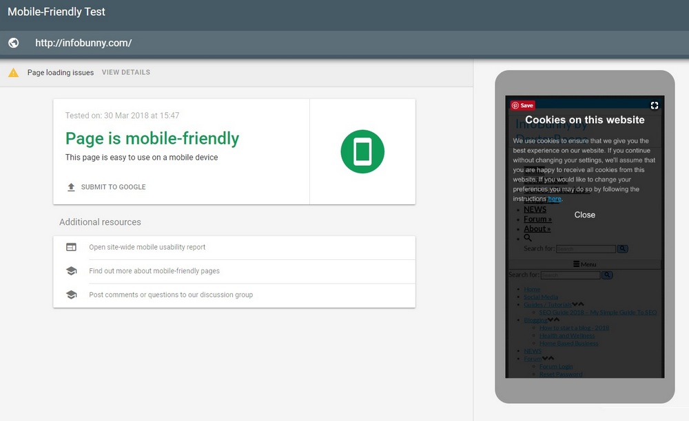
Another great tool to test your mobile site is Googles Mobile-Friendly Test
Just add your page link to the tool, hit return to run the test and just wait.
Your site’s load time and speed are important and that is where Google’s PageSpeed Insights tool comes in handy.
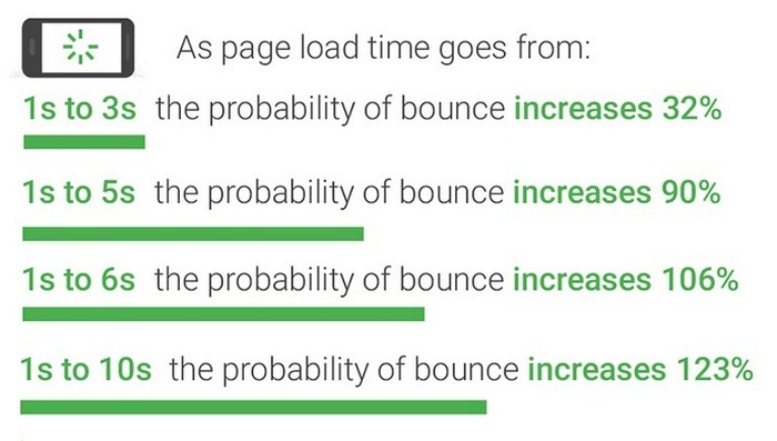
Google recommends that your site loads in under a second for mobile users. This is incredibly difficult to pull off.
According to Google’s mobile page speed study, as page load time slows down from one second to six, the bounce rate increases by 106%.
Here are the results for InfoBunnys Responsive Mobile Site on Googles Page Speed Insights Tool
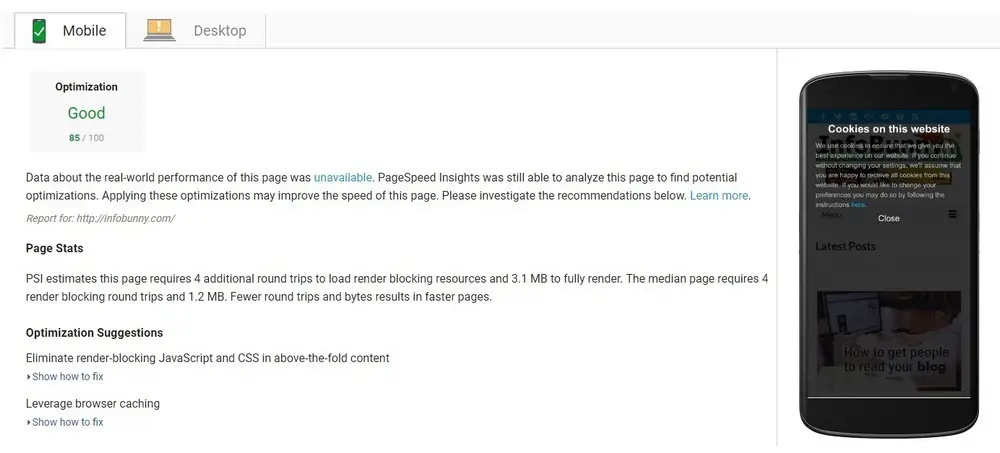
InfoBunny scores an impressive 85 out of a possible 100 for our responsive mobile site which is pretty good.
There are some pretty simple fixes that will help speed up your site ready for the mobile-first index.
Server Time
Mobile page speed is determined by your web coding but also depends upon your server.
The longer your server waits to respond to a request from a browser, the slower your page load time.
How good is your web hosting?
Minimize redirects to accelerate mobile page speed
Redirects are instructions that automatically take website visitors from one page to another location.
Each redirect eats up time, slowing down your page load.
This is problematic particularly for mobile devices and will not be good news for the mobile-first index.
Load above-the-fold content before the below-the-fold content
This just makes sense.
Above-the-fold content is the portion of a Web page that is visible in a browser window when the page first loads. The portion of the page that requires scrolling in order to see content is called “below-the-fold.”
So, in other words, your website should load the content a mobile user sees first prior to the content they might see later from scrolling down the page
Your pages need to be coded so your server sends first the data necessary to display above-the-fold content.
Even if a page is incomplete, the user will experience the content as ready sooner.
Here are 2 WordPress Plugins that will speed up your mobile site and boost your mobile SEO strategy
W3 Total Cache
Page cache is responsible for creating static cache pages for each page that is loaded.
Pages are not dynamically loaded upon each page load.
Caching pages significantly decreases your sites load time and server resources while improving performance.
There are just fewer steps in the chain to complete the load of the site.
I take advantage of the benefits of site caching with a great WordPress Plugin called W3 Total Cache (no affiliation)
WP Smush
If you want to speed up your mobile site for Googles Mobile-First Index then you have to optimize and compress your images.
We talked briefly about optimizing images briefly at the start of this mobile SEO guide but it does need a bit more explanation as it is so important to implement and at the same times it is just so easy to do.
This is an occasion where I would use a WordPress plugin.
I use WP Smush (no affiliation) and that is because with WP Smush you can not smush new images you add but also go back and optimize every image you ever loaded giving your site a speed mobile SEO boost.
WP Smush, simply makes image files smaller individually or in bulk.
For more info on speeding up your mobile site visit, How Fast Does The Mobile Version Of Your Site Load?
All of the above should be implemented on your site but if you really want to speed up the user experience then perhaps you should look towards AMP.
Amp is a Google-led initiative It is a controversial method of serving your site to users but it does solve a number of SEO problems but it also potentially adds a couple of new ones into the mix.
The SEO world is pretty divided on whether AMP is a good thing or bad. A number of big sites have moved to AMP while others are sitting on the sidelines and waiting to see how everything develops.
But what is interesting is that Bing has also joined the Accelerated Mobile Pages bandwagon
What is AMP?
AMP is a Google-led initiative to speed up the web.
Google set up a protocol called “Accelerated Mobile Pages (AMP)“. These pages are separate pages you create, each one shadowing a regular page.
AMP is accelerated in two ways. First, they are stripped down to load faster, but not all elements will show. Second, Google caches them, so that they can be served up quicker to users in a search directly from Google’s server.
Accelerated Mobile Pages solves the mobile speed issue that regular responsive sites have.
AMP pages are served to visitors on different URLs from that of the main site as in .com/amp
The benefits of using Accelerated Mobile Pages
The big benefit of using AMP is speed. As we have mentioned earlier Google wants the mobile experience to be fast and that is exactly what you get with AMP.
And with speed, you get happier visitors more site dwell, more conversions etc.
Google passes on some juice for your pages loading quickly so there are some SEO benefits to its implementation, especially as we are now heading to a mobile-first index.
Your pages also appear in the search results with a small AMP icon indicating that your pages are AMP pages.
This small icon benefits click through to your site as the user knows your pages will load fast.
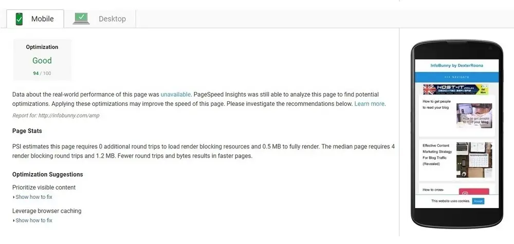
Here are the page speed results for the AMP version of Infobunny.
The responsive version of the site did very well with a score of 85 out of 100. The AMP version eclipses that result though coming in at 94 out of a possible 100.
AMP is fast.
But with the benefits come some problems
Accelerated Mobile Pages are stripped down versions of the original. They are more static and just don’t carry all the resources that normal responsive pages do.
Monetization of your site is impacted when using AMP. If you add Adsense ads to your site they are carried over to your mobile site if your theme is responsive (and most now are).
With Accelerated Mobile Pages your ads are stripped out to keep your site fast.
In fact, any cool feature that you add via a plugin that adds functionality is often stripped out.
It is also suggested that AMP can hurt your link building efforts which as we know is important for SEO
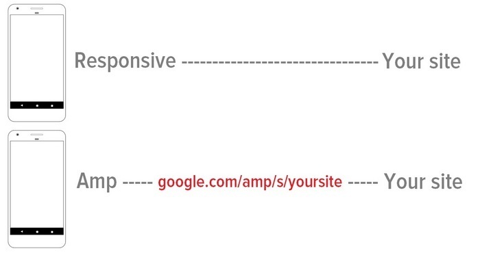
When someone links to your content, those links point directly to your site. However, when someone links to your AMP pages, that link points to the Google.com domain so passing the link juice to Google.
The whole backlink question is difficult to understand.
Backlinks are generally created by those using desktop and laptop computers. And link juice is passed on from one user to another So when you backlink you tend to link to the main website.
The issue being is that your position within Google will be based on your mobile version of the site. Now that is fine if your page is responsive.
They are still linking to your site.
But if your mobile site is AMP then they would link to Google first then Google links to you.
Is this a good reason not to use AMP?
Well, it could be, if this is what will be the case. The problem is AMP is still new. The mobile first index hasn’t even launched yet.
We already know that SEO is going down the AI route with Rank Brain and voice recognition. Could this be the first steps of Google discounting backlinks in SEO?
We know there is a constant battle for Google to understand how webmaster gets their backlinks. Are they genuinely organic or are they gained by a more underhand method?
Will Google pass on link juice that comes to them via AMP pages? We just don’t know.
Despite the fact that AMp is a stripped-down version of your site it is still possible to make a mobile site that looks and feels like the main site.
If you have money to spend then you can pay a developer to set you up.
Alternatively, you can you a plugin if you are on WordPress.
The problem with plugins is that your site can look like a lot of other sites that use the same plugin.
But it is getting better.
You can now purchase AMP-specific themes that really help you customize your site.
If you are interested in implementing AMP then I recommend using AMP for WP – Accelerated Mobile Pages (Infobunny has no affiliation with this plugin or its developers)
How does your site look on mobile?
It is easy to tell how your site looks on a desktop you just edit and preview but it is a bit trickier to really tell how it looks on a mobile device
Today’s mobile user is very aware of the quality level that they can experience when surfing the Web on mobile. They want to achieve their goals as fast as possible with no fuss and the mobile user experience is critical in enabling them to do this.
Navigation needs to be clear. No pinching to zoom in on text or images
Button touch elements need to be spaced and not located too close to each other. And we have already mentioned it, speed counts. Don’t leave your mobile visitors sitting in the waiting room or waiting for a mobile bus.
Mobile design
Once your site is mobile friendly and responsive in design, or AMP if you went for Accelerated Mobile Pages route you need to work on how your content actually looks
Remember you are working to a much smaller scaled-down screen and you need to account for this.
Make sure that all the visual elements look responsive. Do they look correct or are they oversized and hiding elements?
Mobile fonts should be readable, and titles and headings should not occupy most of the screen.
Navigation should be clear and not the only thing that a user sees when opening your site.
Offering a site search option is a good idea if your site is sizable, it will offer another navigation route via your mobile site.
Social Share Buttons
There is no doubt that you need social share buttons on both your desktop and mobile version of your site.
Social buttons tend to work best when at the side of the screen that remains static as the user scrolls.
But there is an issue with social buttons that are positioned to the side and that is that they obstruct the user’s view on mobile devices.
You need to find a way of hiding sidebar social buttons on mobile devices.
The easiest solution that I have found for Infobunny is to use share buttons from the Simple Share Buttons plugin.
Simple Share Buttons gives you the option of hiding sidebar buttons on mobile while still showing them on desktop
Your Content
Content needs to be clear and easily readable and regularly updated to keep it fresh and evergreen.
You also need to be sure that you internally link to your content to avoid orphaned content issues.
One of the essential things that you should bear in mind while optimizing content for mobile is that people like to use voice search on this very kind of device.
Use very short paragraphs, with just 1 or 2 sentences.
Use lots of negative space. Negative space is the space between text, buttons and design elements. If your sentences are all butted up and too close it just makes it much harder to read.
Stand out in the Mobile SERPs – Add schema structured data to your site
Mobile search results show as cards and using structured data helps your search results stand out in the crowd.
Structured data gives you review stars, recipe images and a whole lot more.
If you want more click-through traffic then consider adding structured data to your site.
Mobile SEO Guide 2021 – 2022 – Takeaways
The mobile version of your site is now more important than that of your desktop version.
You know what you like and what you dislike about the mobile internet from your own experiences in searching and navigating sites.
Employ the good and ditch the bad
If you don’t yet have a responsive site then you have to make the jump.
If you don’t want to change your then there are plugin options if you are using WordPress that will give you a pretty good mobile site.
But in all honesty, just move to a responsive theme and you won’t look back.
AMP is a big consideration.
Lots of webmasters have already switched and as you now know there are some big positives to creating an AMP site as well as a few negatives.
But with Googles mobile-first index coming along you have to pay attention to how Google views your mobile site
That is all for now, I hope you found my Mobile SEO Guide useful.
Now it is over to you.
Is your mobile site responsive? Have you moved to AMP yet?
Do you have your own strategy for mobile SEO in 2021/22?
Let me know in the comments section below.
Make sure that you subscribe to the comments so that you are notified when I reply.
Regards
Dexter
RELATED ARTICLES
Never do keyword research again. Do this instead!
How to write Killer Blog Titles that convert into views





Richard Monssen
Hi Dexter,
I’ve removed AMP from my site altogethor and just have responsive design.
Dexter Roona
Have you noticed any change in your SEO rankings?
Dexter Roona recently posted…How to download YouTube Videos
Johanna Galyen
I love it when I already have something that a really smart/technical person like you suggested when you said, “WPBeginner has a great article that covers not only WP Smush but some other alternatives.” I love WP beginner because I don’t really understand the technical side of WP and they are so useful. Thank you for the great information!
Johanna Galyen recently posted…The 4 Lies of Marriage
Dexter Roona
WPBeginner is a go-to site for me because like you said it does break things down for you, and that is how I like to write my articles, as simply as possible.
Dexter Roona recently posted…SEO is not working on my site – Here is the fix
Hazel Jarrett
Hey Dexter, that’s a very useful Mobile SEO Guide. I’ve been mobile responsive for some time, but I’m still on the fence about AMP.
Hazel Jarrett recently posted…5 Reasons Why You Should Be Guest Blogging
Dexter Roona
What is interesting is that my mobile results are 3 or so positions better than those of my desktop version. I do put that down to some degree to site speed so AMP may be a good thing but we will just have to see how it all works out. Gooogle will probably change their mind and say we should do something completely different.
Lesly Federici
Fantastic informative post … I am semi addicted to my phone. I can leave it home when I go out many times. But thinking about an app for PAC … thinking …
Dexter Roona
An APP sounds interesting for Pac
Dexter Roona recently posted…How to download YouTube Videos
Ryan Biddulph
Hi Dexter,
Super duper guide buddy. Big time fan of having a site lightning fast on mobile. My developer fixed my blog up for mobile a while back but hopping on a VPS a month ago made a night-day difference on mobile and lappy. Mobile is the wave of the present and future. Many sites have 80% or more of readers digesting the content from mobile devices. Screens get smaller. Folks hop on lappys less and less. I feel like a dinosaur LOL.
Ryan
Ryan Biddulph recently posted…How To Drive Blog Traffic Through Facebook Live Videos
Dexter Roona
Your dead right, I do consume a lot of content via mobile, but I hate creating it via mobile. I always jump onto my laptop but I guess every blogger does.
Thanks for stopping by I appreciate it.
Dexter Roona recently posted…How to download YouTube Videos
Ryan Biddulph
I use my phone like 3 seconds a day to read blogs LOL…if that.
RB
Ryan Biddulph recently posted…How Can You Really Stand Out During Your Blogger Outreach Campaign?
Dexter Roona
I’m with you on that. Mobile is not a creating medium its a social medium
Dexter Roona recently posted…Your 10-Step Strategy to Successfully Managing Local SEO – Your Local SEO Guide
Chirantan Roy
This is very good and helpful article. Thank you for sharing this article.
Dexter Roona
Your welcome, I am glad you have some takeaways from it
Dexter Roona recently posted…SEO is not working on my site – Here is the fix
Sadhan Pal
Hi Dexter,
Thanks for the SEO guide for mobile. Mobile visitors are also important for getting traffic for a site. A huge amount of people use mobile than desktop. So, it is very important to grab mobile traffic. Best wishes for the next post.
Sadhan Pal recently posted…SSC Result 2018 by educationboardresults.gov.bd
Dexter Roona
Thank you, I will check out your comment Luv link to see what you are up to.
Dexter Roona recently posted…How to avoid WordPress problems
Erika Ann
As a newbie in SEO, I didn’t know that there are mobile SEO tools. It amazes me how SEO improves without it being a study in a university or something. I have something to research about thanks for this.
Dexter Roona
Yes Webmaster Tools, for example, has lots of valuable tools to help you with SEO
Dexter Roona recently posted…How to Start A Blogging Business for Money
Gaurav Kumar
Hi Dexter,
It is necessary to optimize every site or blog for Mobile. Smartphone are overtaking the laptop population and things will be quite happening if a blogger work with mobile seo.
Thanks for sharing.
Gaurav Kumar recently posted…10 Common Business Card Mistakes
Dexter Roona
Your correct, everything is mobile, funnily enough, screens are getting bigger bit by much but kind of mini tablet size.
Navin Rao
Hello Dexter,
Like you, I too Optimize my site codes with W3Total cache and Images with WP smush. It certainly makes the difference to speed up the site if configured well.
As the site speed is a big concern where’s the SEO is concerned. No wonder makes a huge imapct in rankings.
To speed up the sites AMP was a good move by Google, though not a perfect fit for all kind of websites. For me a mobile responsive theme with required features is always being enough.
Thanks for sharing, valuable one 🙂
Have a great day ahead!
Navin
Navin Rao recently posted…Hide All IP Review: Amazing VPN to Surf Web Anonymously and Securely
Dexter Roona
I took the plunge with AMP and I have no complaints so far.
Anil Agarwal
Great post as always Dexter,
Blogging is certainly not easy, and when I go through some of the technical aspects of it, I shake my head because if one start looking at those things, they’re enough to scare the hell out of him and prevent him from starting a blog. However, the good thing is that you can always hire someone to take care of those techie parts if you’re not a techie person.
Talking about mobile seo, I don’t really think there’s a need to explain to anyone today the benefits of having a mobile optimized website, I know that the benefits are already speaking for themselves, and anyone who is still not paying attention to them will sooner or later have himself to blame.
Apart from that, this is really a very informative and helpful tutorial. I agree with every point you made here, and I’m sure a lot of newbies will find it super interesting.
Thanks a bunch for sharing man, and do enjoy your weekend.
Dexter Roona
Thanks yes I try to break it down so that it is simple and anyone can then cover SEO.
If your new to SEO all you have to do is follow my guides and just ditch all the keyword tools and planners and volume checkers. Just find the search users intent by Googling and you see all the LSI keywords you need to be setting up for.
Dexter Roona recently posted…Your 10-Step Strategy to Successfully Managing Local SEO – Your Local SEO Guide
SEO
Good SEO search engine optimizations thanks for art
Monna Ellithorpe
Hi Dexter,
What a lot of information. Is it me or does anyone else sometimes feel like the “little guy” is getting edged out. I know I’ll have to read this post a couple of more times to understand it.
Not because of your writing, Dexter, but because of the stuff I’ve never heard of and constant new things they seem to come up with. Okay, I’m done complaining.
You have given a lot of great information which I will be going over again.
Thanks again and have a good weekend.
Monna Ellithorpe recently posted…10 Creative and Health Benefits of Journaling
Dexter Roona
yes here is another hoop, and another and another.
Dexter Roona recently posted…How to get people to read your blog
Qasim
Hi Dexter,
This is exactly what I needed, I have seen your other post on PAC and commented on it and I decide to make sure my website is mobile optimized especially with the news of mobile first index. Luckily I found your post here and I will follow your tips to make sure my website is well optimized for mobile. Currently, it’s showing medium. Have some work to do.
Dexter Roona
Great, I’m happy that the content I have shared is of benefit to you 😉
Dexter Roona recently posted…Effective Content Marketing Strategy For Blog Traffic (Revealed)
Hazel Jarrett
Apparently, the first batch of Google mobile-first indexing notifications goes out today!
Hazel Jarrett recently posted…39 ways to get more mileage out of your existing content
Dexter Roona
It’s a good job we are both all set for Mobile-first. I’m hoping I see a bump in rankings cause my site is AMP and so pretty fast.
Donna Merrill
Hi Dexter,
Awesome Mobile SEO Guide. I had my tech guy speed up my blog a while back and it made such a great difference on mobile. When considering most people use mobile instead of their computers, it is so important to do.
-Donna
Donna Merrill recently posted…Why Video is so Important for Bloggers
GSIM
Great article, thanks for the heads up.
Dexter Roona
Your welcome I am glad you found the article useful.
Oliuzzaman Shanto
Very helpful articles keep it up want more articles SEO related.
10seos
I agree with your all points. Now a days mobile friendly site is a ranking factor for you and can get a lot of benefit from it! Thanks for sharing
Best SEO Link Building Tips
Thanks for sharing your valuable thoughts!
Best seo Company
Thank you for this amazing post. If we want our website to run at peak performance, then we must follow this guide!
Naveen Kumar
Thanks for your blog it’s very nice.This is a really important information as it is very educational and helpful for us.Waiting for your next posting.
Naveen Kumar recently posted…Google Confirms Small Algorithm Update on September 27th
jesssica morgan
Thank you for sharing such a detailed and incredible post. I’ll be looking forward to more of these blogs from you in future.
Md Tariqul islam
Hi, thank you for sharing your blog post… SO helpful!!! give me some advice. I will wait for your reply.
Louis Huynh
Love this comprehensive guide, good one.
Eva Smith
Nice blog post about doing mobile SEO friendly test for all website and it’s very important. As we all know that now a days user’s are switching to mobile and that’s why we should target mobile user very first. Nice blog post keep the good work going.
PAM Company
I have spent the last 1 hour reading this and taking notes for my own blog, Very helpful! Thank you.
Mind Mingles
It’s a very interesting and knowledgeable post. Through this post, I learn many things. I appreciate your work and efforts. Thanks
Mind Mingles recently posted…Top 3 SEO Tips To Grow Your Business Services In 2020