Get your website ready for mobile
Is your website ready for mobile? It seems almost a silly question to ask in 2017. Of course, it is, right?
But it’s worth taking a second look to see how it appears on mobile. It is equally important to think how Google sees it on mobile.
The first clue I had that my site might not be as mobile-friendly as I thought was an alert in Google Webmaster Tools that some touch elements were too close together. From there, came a full review. There’s more to it than just tech.
Below are 10 things you should do to cash in on the mobile revolution
When I say “revolution”, I mean it in two ways:
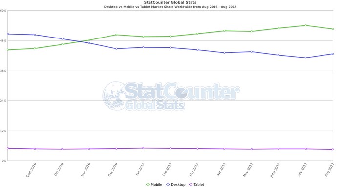
First, more people now surf the Internet by mobile than by desktop and laptop. That’s a lot of customers to put at risk by not having a website ready for mobile visitors. What’s most important is that many people who buy on desktop or at a retail location, make their buying decisions on their mobile devices.

Second, Google adopted a “mobile first” index. That means that its primary index is now skewed to show mobile-friendly web pages. We have not yet seen this effect on its desktop index, but it probably will soon. Why? Follow this scenario:
- You do a Google search for something on your desktop.
- What you find is interesting.
- You send it to a friend.
- The friend opens it on mobile…and it looks awful.
To prevent this, Google might start demoting non-mobile-friendly websites even in desktop searches. It’s almost a no-brainer, and exactly the reason for having a mobile-first index.
RELATED POST – SEO Guide My Simple Guide To Search Engine Optimization
Be fully responsive
What does a “responsive” website mean? Very simple – it adapts to whatever size screen it’s on.
Oversized wall screen? No problem.
Mini tablet? No problem.
Laptop? No problem.
iPhone? No problem.
You don’t need each device to check if your website is fully responsive. On a desktop or laptop, take the left or right edge of your browser window and drag it slowly toward the opposite side. As the window narrows, watch the text wrap to match the width of the screen. Watch the images get smaller as the window narrows.
If the text and images don’t respond to the change in size, your website is not responsive. Get a new theme or hire a programmer. This was a huge focus for me about a year ago. It’s one of three changes I made that have greatly increased the number of writing clients I’m getting.
Accelerated Mobile Pages
Google set up a protocol called “Accelerated Mobile Pages (AMP)“. These pages are ghost pages you create, each one shadowing a regular page. They are accelerated in two ways. First, they are stripped down to load faster, but not all elements will show. Second, Google caches them, so that they can be served up quicker to users in a search directly from Google’s server.
Some people have added accelerated mobile pages to their websites. Other prefer being fully responsive. Doing both could be overkill, since Google won`t send anybody to your fully responsive pages if they have an AMP page cached for that URL.
I have no plans to implement AMP. If Google starts giving better rankings to AMP pages, I might change my mind. But I have much more control over responsive pages. I don`t want my pages to show up stripped down.
If you decide to AMPify your website, there are tools that can help. For instance, here is a list of WordPress AMP plugins.
Optimize images
Speed is important when determining if you are website ready for mobile. Speeds a major motivation behind AMP. One easy way to boost the speed of your mobile pages is by scaling down the size of your images.
First, Make sure your images are no bigger than you need. If the space for your image is only 600 pixels wide, don’t display a 3,000-pixel-wide image. If people need to be able to see great detail when they click through, use two different images: a 600-pixel-wide image on the page and a 3,000-pixel-wide image when they click through.
Second, optimize the images. I use Opimizilla. It’s a free online tool. You just drag and drop the image you want scaled down, and Optimizilla automatically optimizes it. Just save it to your hard drive, and use the optimized image instead of the original.
More subheadings
People don’t read on the Internet. They scan. That’s not totally true. We scan until we see something that catches our attention. Frequent subheadings are important for catching people’s attention.
People not only scan mobile, but they scroll as they scan. Subheadings are even more important on mobile than on desktop.
Stop the scanning. Stop the scrolling. Start the reading.
Smaller paragraphs
More important than subheadings is paragraph length. You probably already know that large blocks of text look intimidating. The bigger the paragraph, the more work it looks like to read.
If a paragraph looks big on a desktop, imagine what it looks like on mobile. On a phone, it could fill a screen. Even half a screen or a third of a screen looks big and just too easy to scroll past.
Bite-size info
It’s not just huge paragraphs. Even small blocks of text are easy to skip over.
One solution is to use lists. I try to create bullet lists whenever a sentence has a list of at least three items. This can turn a very long and challenging sentence into three easier-to-read bullet points.
Hide less important content
I’ve also restructured some information so that it is not visible on loading the page. You’ll see this on service pages, such as on my blog writer page. See what happens when you click on “Tap or click to read more reasons to hire a professional blog writer.” This allows me to include useful long-form content, without overburdening the mobile user. Remember that text wraps on mobile. What shows up on three or four screens on desktop can take up 12 or 15 pages on a phone.
Anyone who wishes can still open up the details. In my case, this is background information for people who like to read more and get an idea of what’s involved.
Keep your CTA visible
I thought I was really cool. I had a sidebar query form that floated on the right side of the screen. No matter how far down a page you scroll, the form floats. The idea is that whenever somebody thinks about hiring us, the form is right there. No work to find it. It’s almost a no-brainer to fill it in. Come to think of it, I was really cool. But not so cool on mobile.
The problem is that the form itself is about the size of a phone screen. Obviously, it can’t float in the sidebar on mobile.
So instead, I put a button that floats atop the page on mobile. On desktop, the button replaces the form only when one scrolls below the form.
Here is what the form looks like on desktop.

Here is what happens when you scroll past the form.

And here is how it looks on mobile (quickly using that trick about narrowing your browser).

Now I’m really cool again 😉
Verify your website is ready for mobile
Don’t forget to verify that your website is ready for mobile. I said that you don’t need each device to see if your website is fully optimized. Narrowing your screen can quickly tell you if it’s not.
But once the work is done, you should check it on different devices. You might just find further improvements to make.
It’s also worth checking in with Google Webmaster Tools. After all, if there is something Google still doesn’t like, it’s worth at least checking it out.
So is your website ready for mobile? Let me know in the comments below!
Related Posts
- Is your website ready for mobile? - September 24, 2017


Elise Cohen Ho
Mine is actually not. My photos are not resizing to difference devices properly. I will be working on that this week.
Dexter Roona
Is your theme not responsive?
Russel
Very well written David and it is true in fact, I have an ecommerce store built with wordpress and woocommerce. I had every thing perfect on website from content to high quality images. We were using Google adwords for traffic BUT the sales were not happening the way we expected. We changed the layout of our website many times, Started doing FREE Shipping but nothing was working for us.
At last, we decided to ask our users especially those who added products in cart but did not buy it and we got shocked when they said that they did not buy the products because it takes ages to load the website, which eventually made them frustrated and made us fools too. A friend of mine recommend us http://www.wpfastspeed.com to get our website speed fixed and after they did their work, Our sales have increased by 30% and now more users are showing interest in our products.
For everyone who is serious about their online business, I would recommend them to get your website speed fix before you spend any money on advertisement or content. You can check how fast your website loads using this tool http://tools.pingdom.com/
Asad
A very important topic has been mentioned that most bloggers forget to focus on. I too experienced websites that do not respond speedily and what I do is click back button even before seeing is there a useful content on a website. All of the above tricks including hiding non-useful content and images and videos from loading makes the website better.
Asad recently posted…R2-D2 Robot – Brought to life from a galaxy far, far away
Asad
I want to suggest that having number of daily mobile users, one must first try to make one’s website or blog optimize for cell phones than doing anything else. It is very much important now a days.
jesssica morgan
Thank you for sharing this post. I’ll be looking forward to more of these blogs from you in future.
David Starc
Such a valid points are mentioned here for checking website is ready for mobile